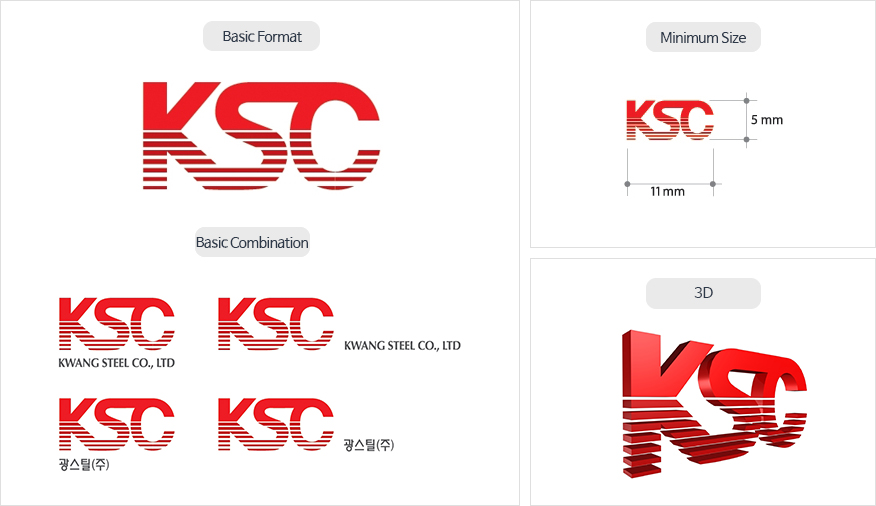
The CI of the company is composed of its first initials. It directly expresses our unique and powerful perception for a fast and powerful perception of the company image. The red color symbolizes light and the white lines indicate the rising sun, signifying to become the center of the architectural world.
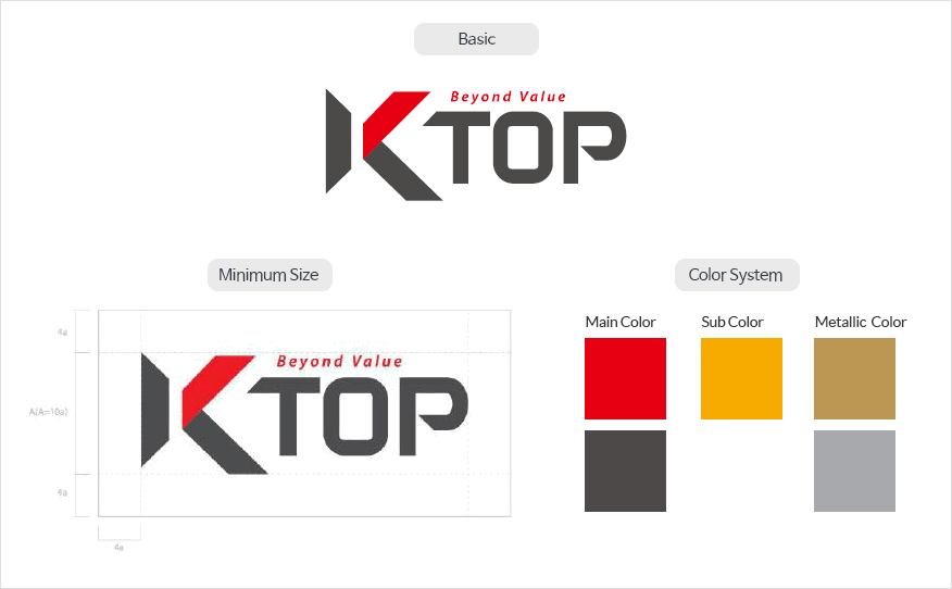
The pride as the leader in architecture and the core competence of the brand was simply yet passionately expressed in “Pride K, Flag K” concept in red. Moreover, the symbol of architectural materials was rigidly and stably developed on the K-TOP logo type.